


Tastoe, a new food delivery brand.
Van Smaak prepares and delivers 6000 to 7000 meals per day. They have done this for more than 45 years. Their expertise in cooking and their knowledge of logistics helped them to develop a new product that targets a younger audience. But how do you position a new product in a crowded market?
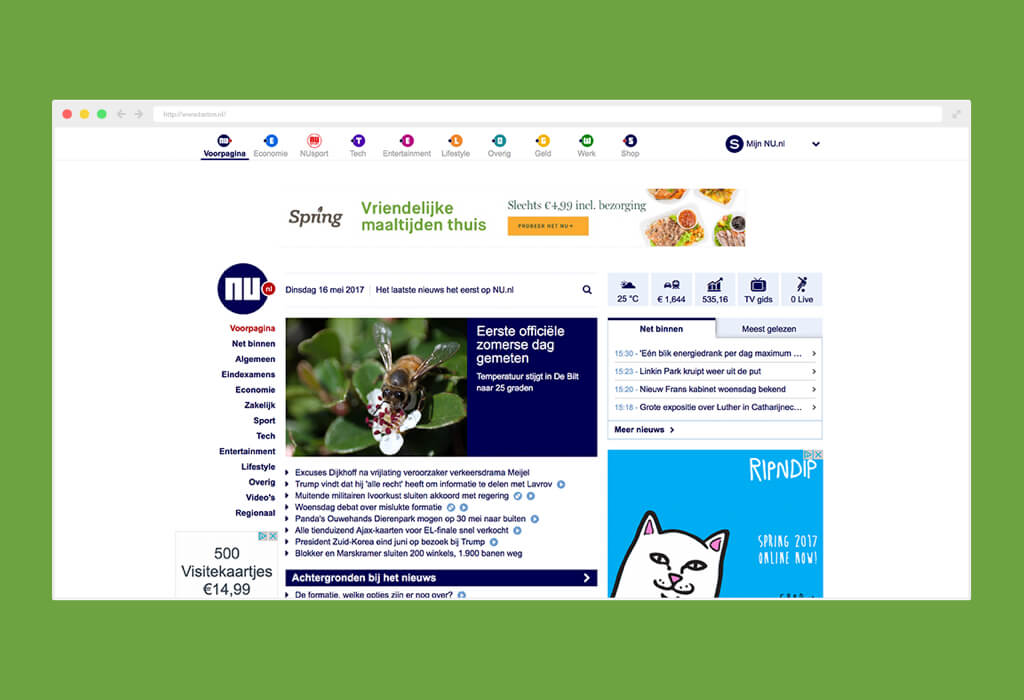
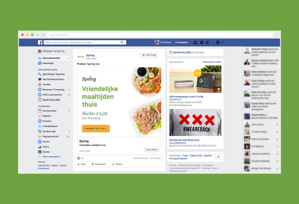
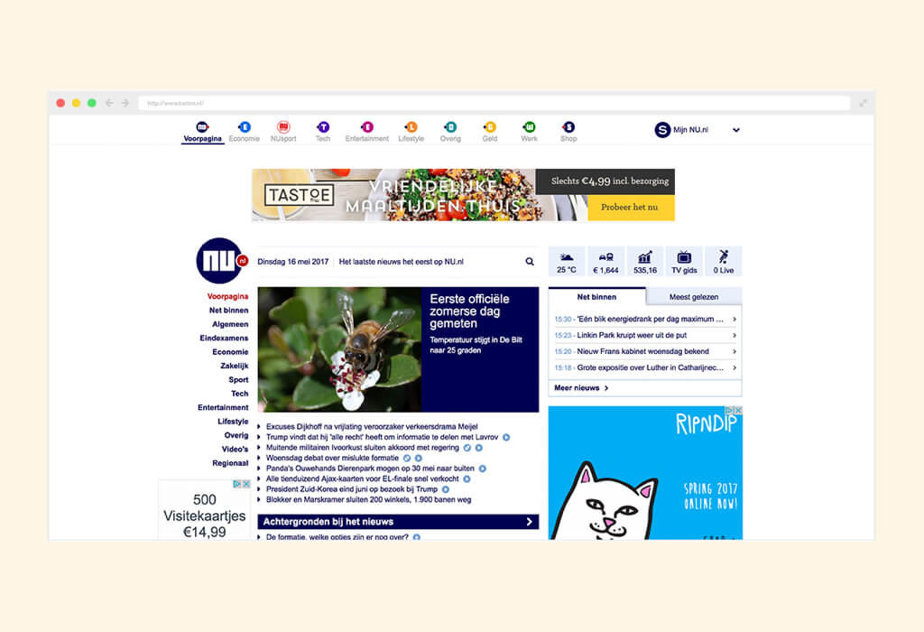
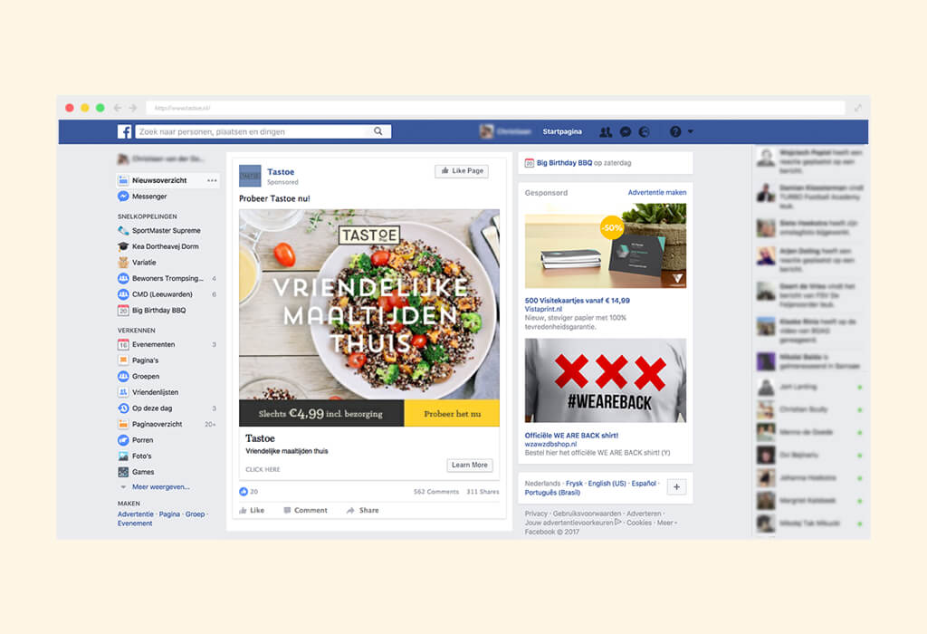
For this project we didn’t want to be led by opinions and assumptions but wanted to make choices based on facts. Based on a market- and target group research, we developed not one but four brand concepts. Each concept with its own logo, slogan, visual style and one-page website. Through online advertising on Facebook and Google we reached thousands of people to test the different brands.
Not only the concepts but also combinations of brand elements were tested to measure which part of the brand converted better. The winning brand was: Tastoe. The brand was then expanded with resources such as: packaging, website and photography.
ROLE
Designer of brand and website
CLIENT
Van Smaak
YEAR
2016
TYPE OF WORK
Branding, name, graphic design, illustrations, webdesign, photoshoot

"Bedankt Martijn!
Wij hebben Martijn ingehuurd omdat wij een goed idee hadden, maar nog niet de kennis in huis om de 'branding' te ontwikkelen. Ons concept: gezonde, verse maaltijden voor werknemers die bij de werkgever gratis worden bezorgd. De medewerker kan na het werk de maaltijd meenemen en thuis direct opeten. Dit scheelt tijd welke heel kostbaar is in onze drukke levens!
Martijn heeft goed geluisterd en ons advies gegeven in de stappen die we moesten zetten. Hij heeft op een creatieve en doortastende wijze de basis van ons product neergezet waardoor wij dit verder konden uitwerken. Daarnaast heeft Martijn een goed netwerk van professionals die ons hebben geholpen met onder andere de fotoshoot en online onderzoeken. Nogmaals bedankt Martijn voor alles wat je hebt gedaan voor ons prachtige product Tastoe!"
Lieke E. Smit
Verkoopmanager Van Smaak
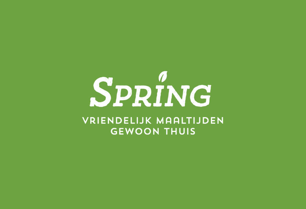
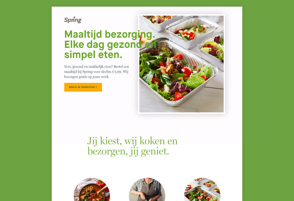
Concept 1: Spring
From the four brand concepts we created two brands and test them online.
The Spring brand-concept aims for people who have a healthy and active lifestyle. The uplifting name, fresh colours and modern fonts give this brand a fresh and active visual identity. We use a lot of green and white to give it a fresh feel.


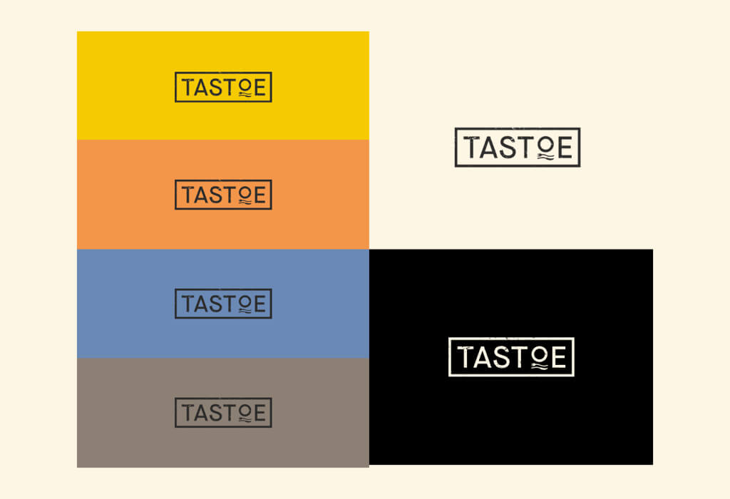
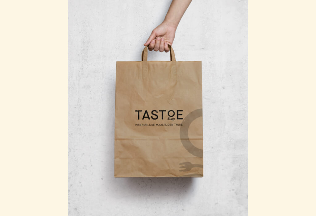
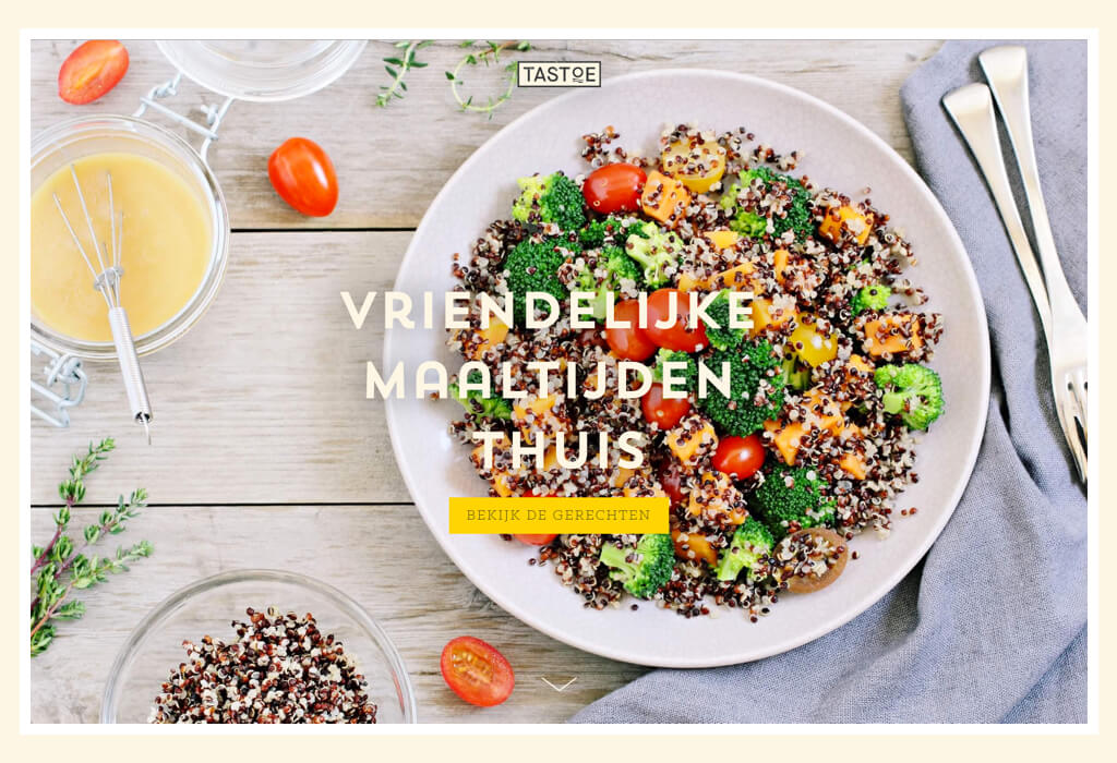
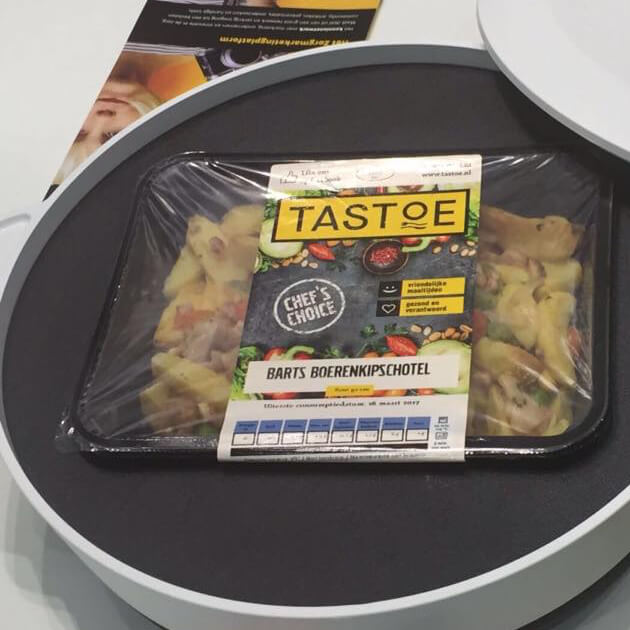
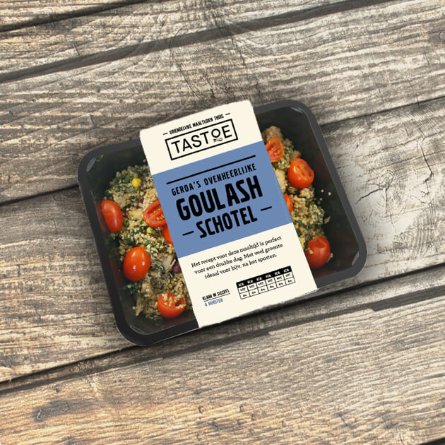
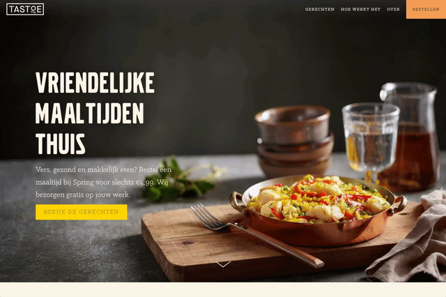
Concept 2: Tastoe
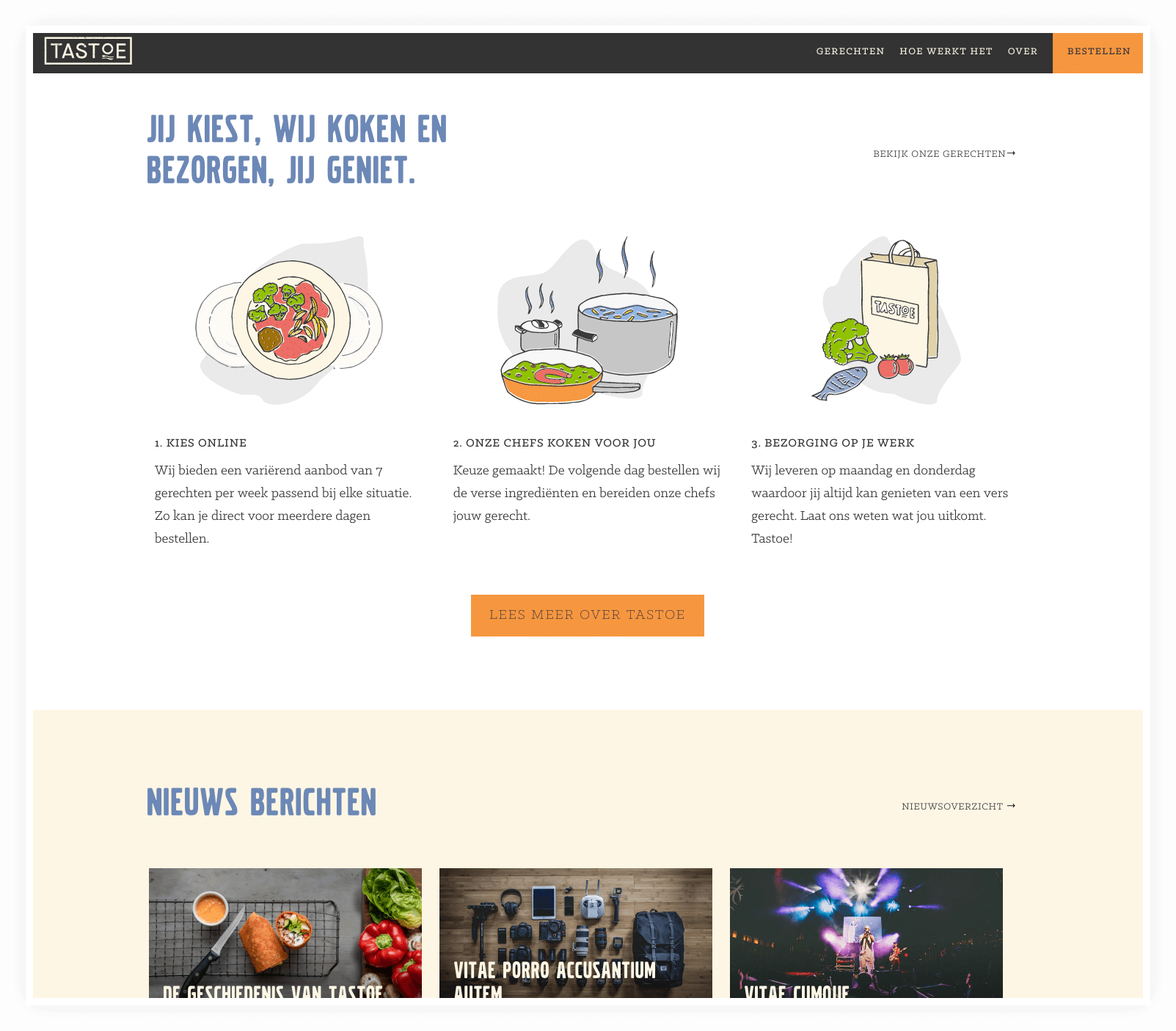
The second brand is Tastoe. Here we aim for a friendly feel and visual identity. This brand concepts aims for people who want a meal just like home. As if a good friend or one of their parents prepared it for you. With warm colours and homemade-style font we gave the brand experience a more personal touch.
Based on the online marketing results we discovered that the visual style of Tastoe converted better than Spring. After some more A/B tests we figured out the best way to position Tastoe and design the new website.


Branding
Where the market is flooded with the terms 'healthy' and 'fresh' we saw the solution in 'friendship'. We developed the promise "Friendly Meals" with the matching name "Tastoe".
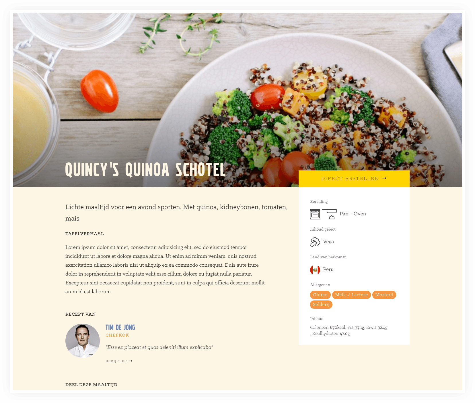
Tastoe is like a good friend who does not just prepare his meals for taste, but it also knows your situation. Do you have an important presentation tomorrow? Go for some extra Omega 3 and Vitamin C and choose Vincents Fish Dish. Play sports tonight? Then go for Quincy's light but nutritious quinoa dish.
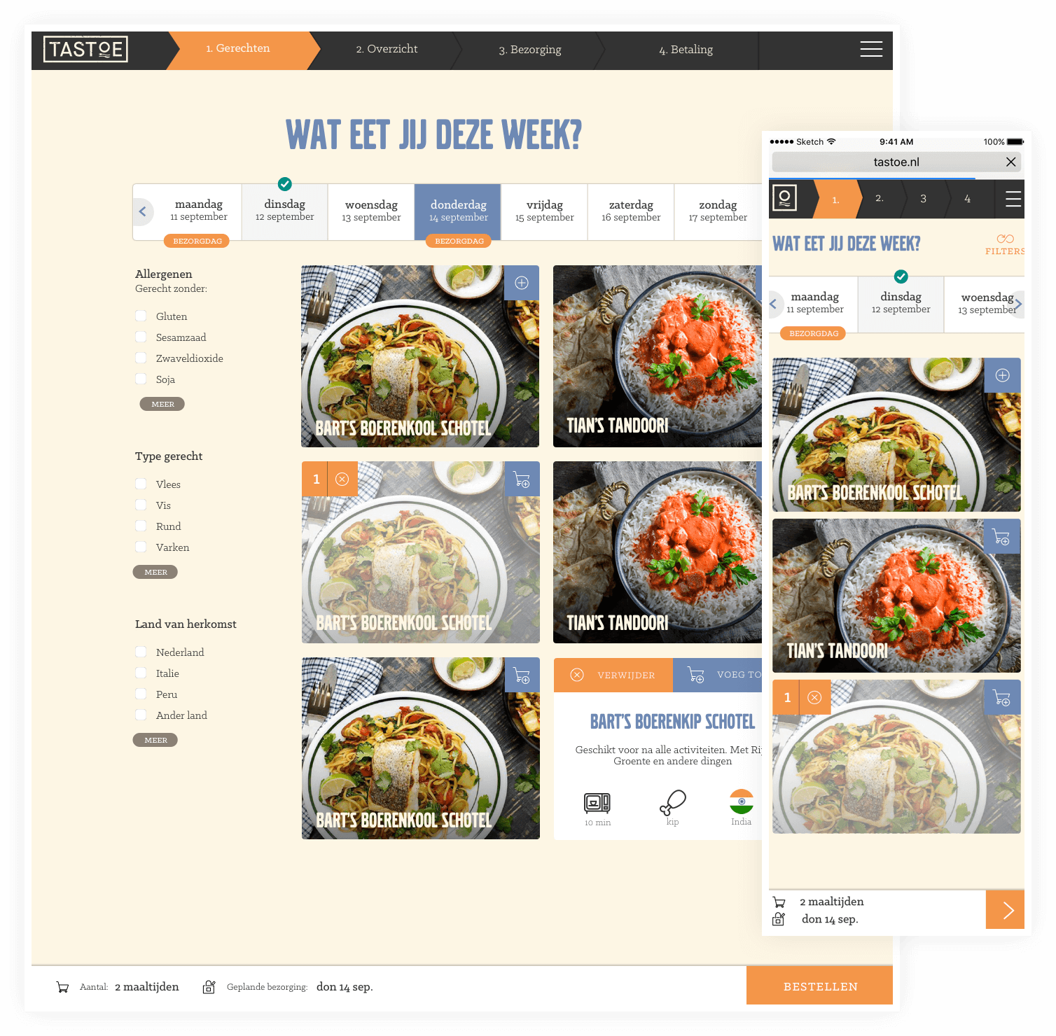
All the meals are named after humans to give it a more personal touch. Examples are: Bart's Boerenkipschotel, Robins Runderlap or Gregors Goulash.


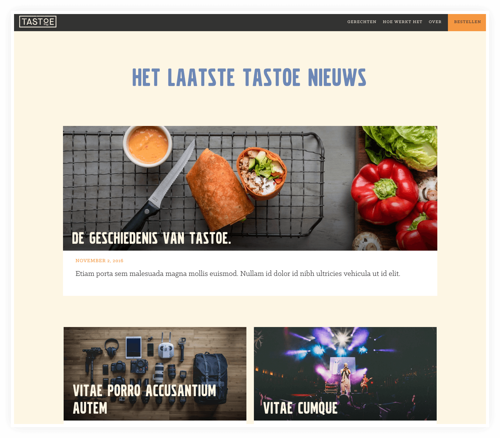
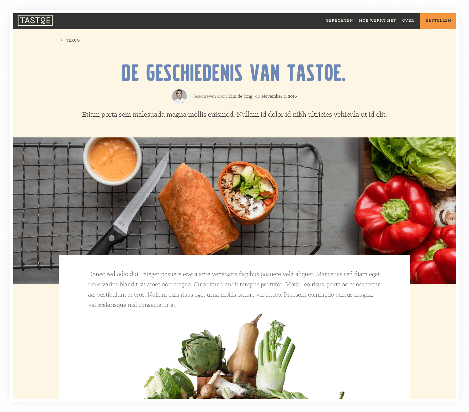
Website
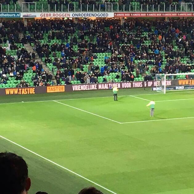
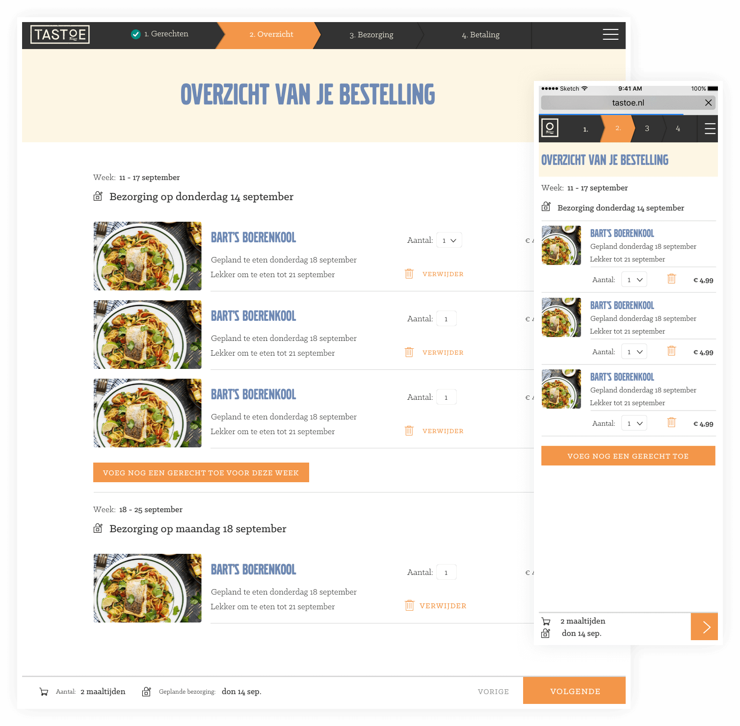
The visual identity comes alive online. The website tells the story and aims to create sales. For regular visitors we designed a smart ordering system where you choose your meals per day and can quickly check out. The development is done by Ultraware.
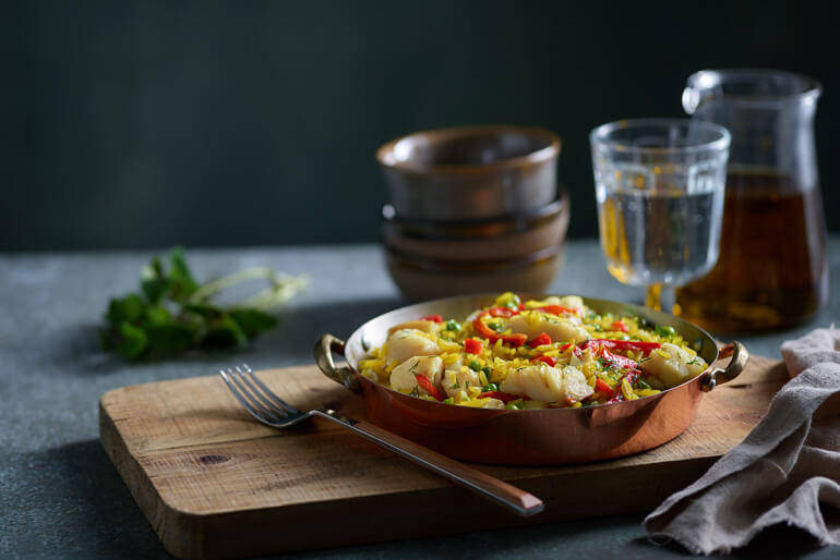
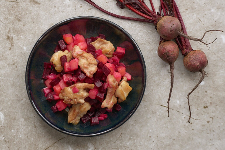
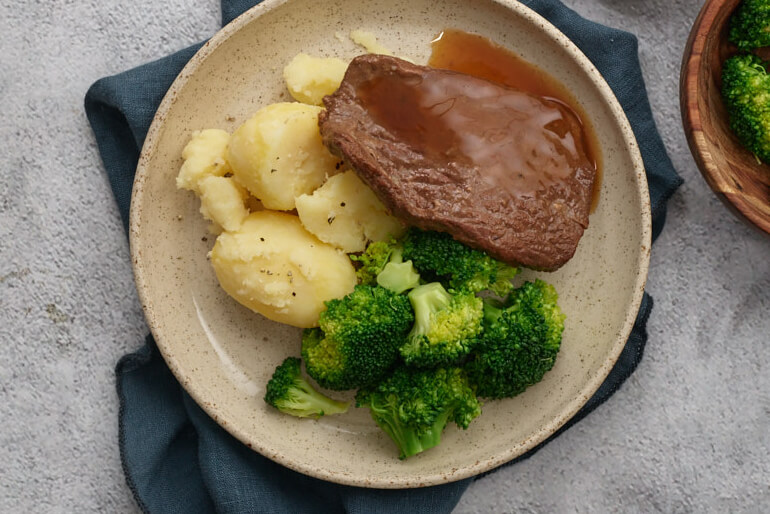
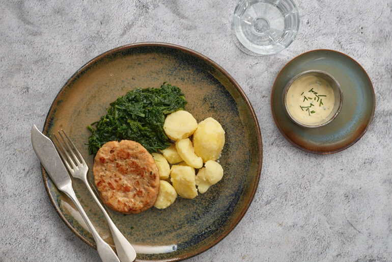
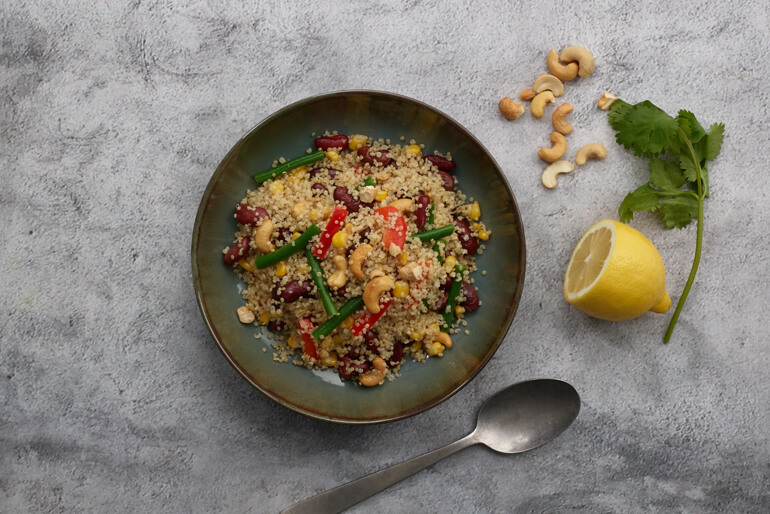
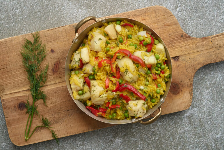
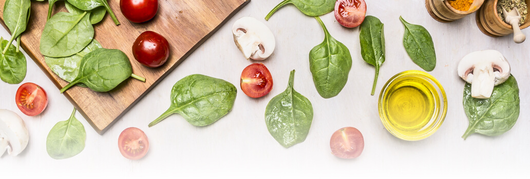
Photography
The photography is done by Ewoud Rooks and the styling by Alexandra Schijf.