


A new website for 'Lekker', the Dutch alternative to the Michelin guide.
The 'Lekker' guide was founded in 1977 to highlight the best Dutch restaurants. Every year they visit over 700 restaurants to select the famous 'Lekker Top 500'. The brand needed a digital environment that enriched the content of the guide itself and an online place to store all their reviews and stories.
The assignment was to create a unique website that inspires and functions as a 'go to tool' for finding the best restaurants The Netherlands has to offer and learn about them. With this goal in mind content is key. That's why we created a website that is easy to navigate and perfect to hop from story to recipe and from restaurant-review to a personal chef-profile. The goal is to learn and get lost in the culinary world of Lekker.
ROLE
Designer
CLIENT
Pijper Media
YEAR
2018
TYPE OF WORK
Concept, webdesign

Annelies Pijper
Editor in Chief Lekker, Grazia, Marie Claire & Beau Monde
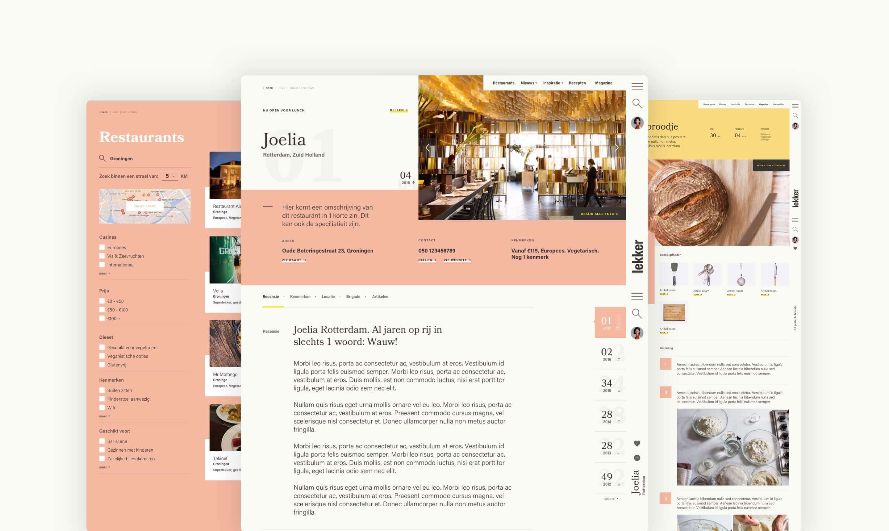
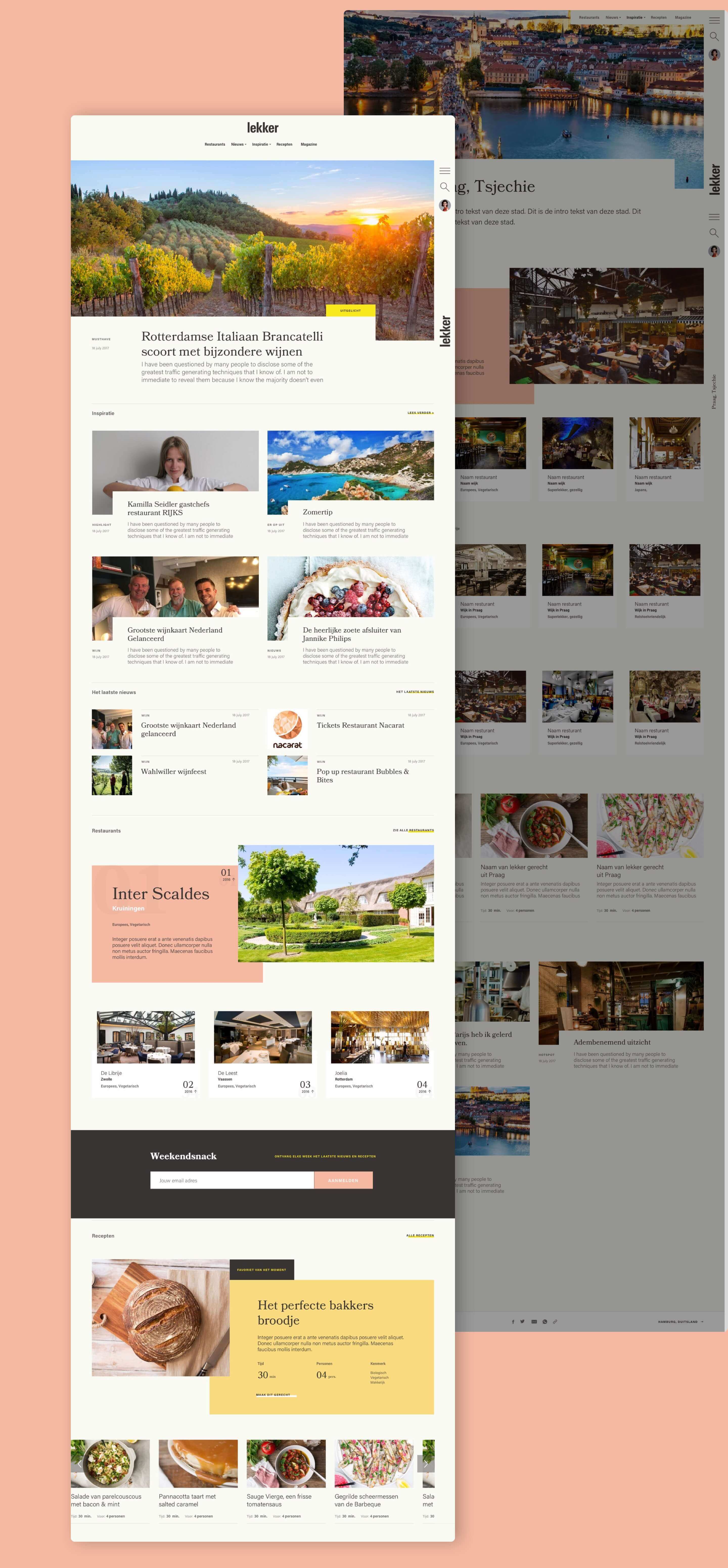
Designed for any device
Whether you are watching it on a desktop, tablet or mobile phone, the website always looks good and gives the viewer the right experience.
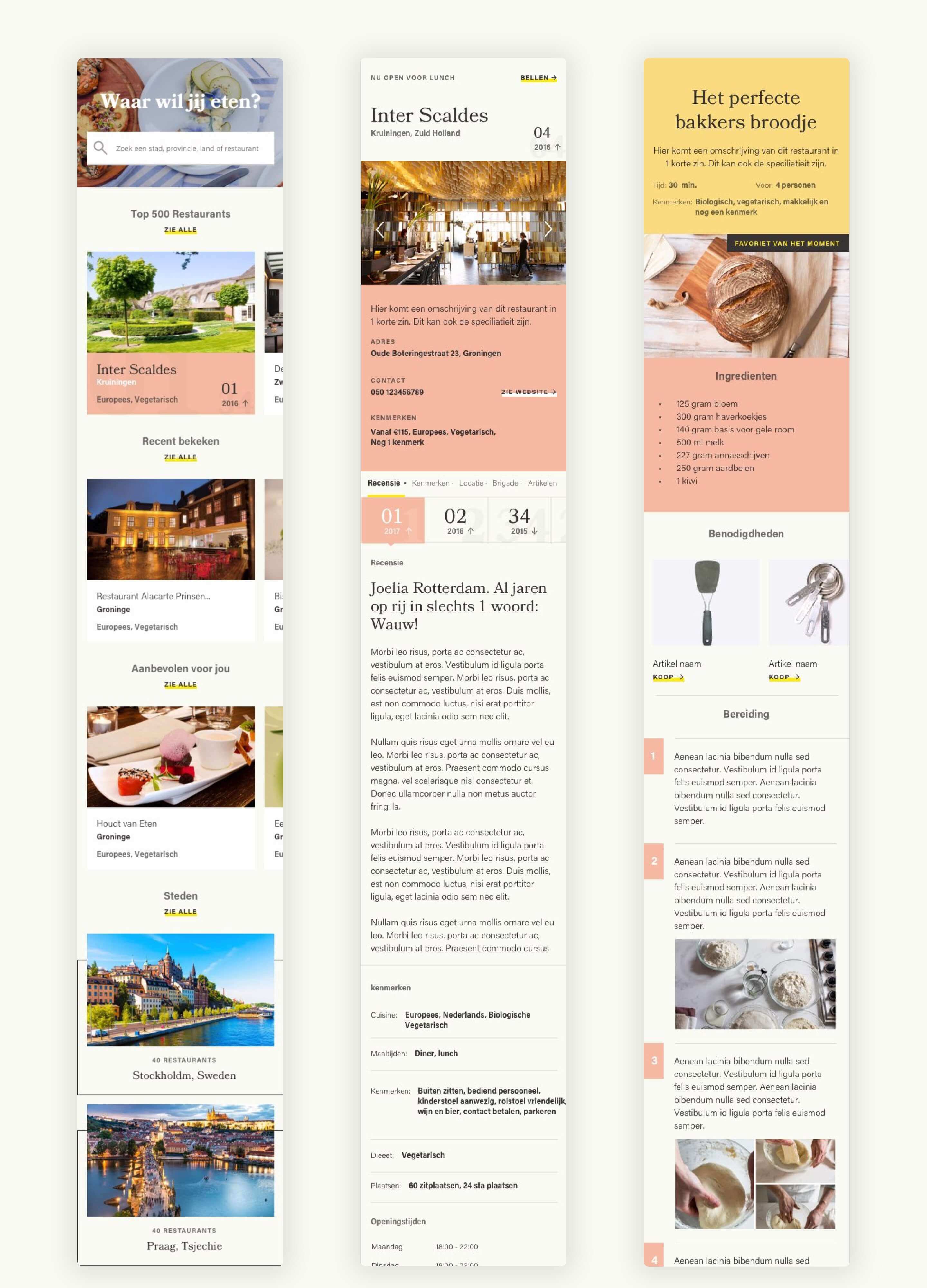
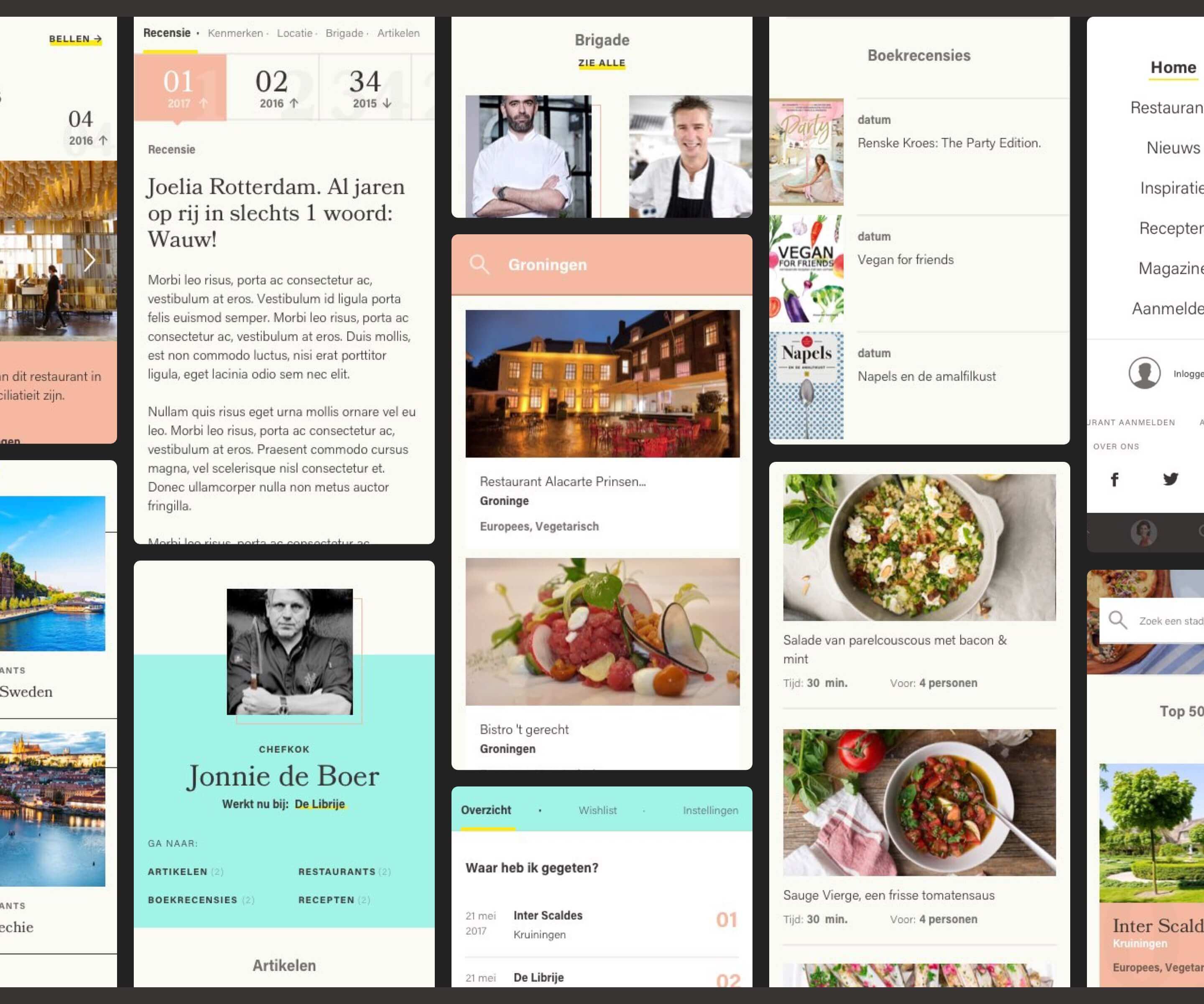
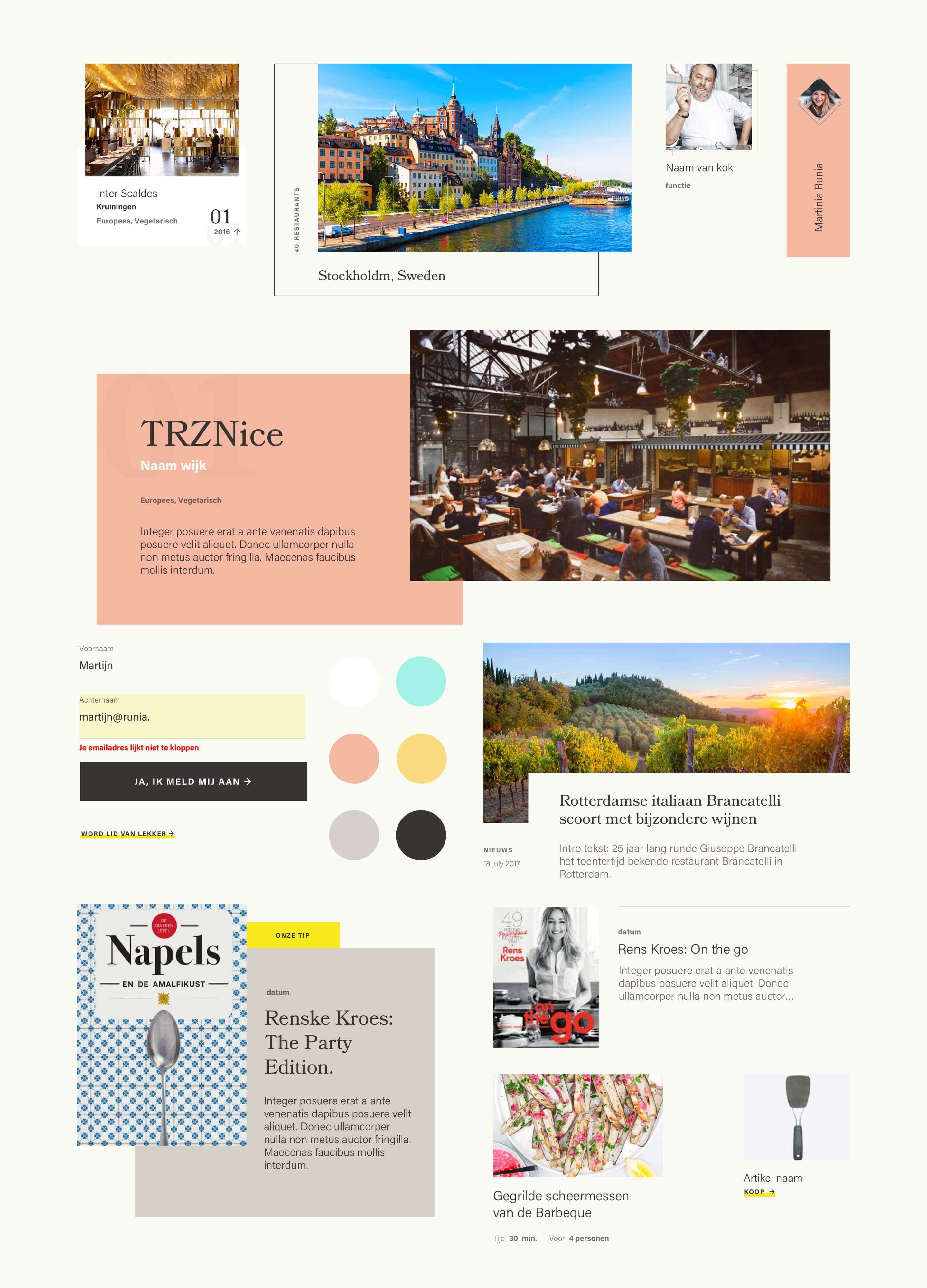
User interface
The design really stands out in all of its elements; with the use of lines and squares we created a playfulness. The subtle colours in combination with the photography make it feel light and fresh while the typography is old fashioned but slightly funky. Perfect for readability!